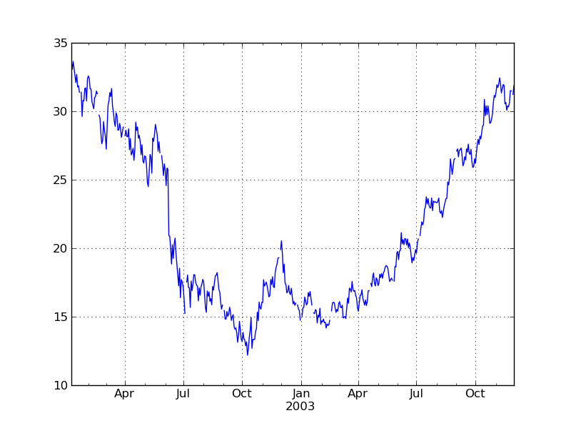
import datetime
import matplotlib.pyplot as plt
from matplotlib.finance import quotes_historical_yahoo
import scikits.timeseries as ts
import scikits.timeseries.lib.plotlib as tpl

date1 = datetime.date(2002, 1, 5)
date2 = datetime.date(2003, 12, 1)

# retrieve data from yahoo.
quotes = quotes_historical_yahoo('INTC', date1, date2)

"""
The dates from the yahoo quotes module get returned as integers, which happen
to correspond to the integer representation of 'DAILY' frequency dates in the
scikits.timeseries module. So create a DateArray of daily dates,  then convert
this to business day frequency afterwards.
"""
dates = ts.date_array([q[0] for q in quotes], freq='DAILY').asfreq('BUSINESS')
opens = [q[1] for q in quotes]
raw_series = ts.time_series(opens, dates)

"""
`fill_missing_dates` will insert masked values for any missing data points.
Note that you could plot the series without doing this, but it would cause
missing values to be linearly interpolated rather than left empty in the plot.
"""
series = ts.fill_missing_dates(raw_series)
fig = tpl.tsfigure()
fsp = fig.add_tsplot(111)
fsp.tsplot(series, '-')

"""
Add grid lines at start of each quarter. Grid lines appear at the major tick
marks by default (which, due to the dynamic nature of the ticks for time
series plots, cannot be guaranteed to be at quarter start). So if you want
grid lines to appear at specific intervals, you must first specify xticks
explicitly.
"""
dates = series.dates
quarter_starts = dates[dates.quarter != (dates-1).quarter]
fsp.set_xticks(quarter_starts.tovalue())
fsp.grid()
plt.show()

import numpy as np
import matplotlib.pyplot as plt
import scikits.timeseries as ts
import scikits.timeseries.lib.plotlib as tpl
from scikits.timeseries.lib.moving_funcs import mov_average_expw

# generate some random data
data = np.cumprod(1 + np.random.normal(0, 1, 300)/100)
series = ts.time_series(data,
                       start_date=ts.Date(freq='M', year=1982, month=1))
fig = tpl.tsfigure()
fsp = fig.add_tsplot(111)
fsp.tsplot(series, '-', mov_average_expw(series, 40), 'r--')
plt.show()

import numpy as np
import numpy.ma as ma
import matplotlib.pyplot as plt
import scikits.timeseries as ts
import scikits.timeseries.lib.plotlib as tpl

# generate some random data
data1 = np.cumprod(1 + np.random.normal(0, 1, 300)/100)
data2 = np.cumprod(1 + np.random.normal(0, 1, 300)/100)*100
start_date = ts.Date(freq='M', year=1982, month=1)
series1 = ts.time_series(data1, start_date=start_date-50)
series2 = ts.time_series(data2, start_date=start_date)
fig = tpl.tsfigure()
fsp = fig.add_tsplot(111)
# plot series on left axis
fsp.tsplot(series1, 'b-', label='<- left series')
fsp.set_ylim(ma.min(series1.series), ma.max(series1.series))
# create right axis
fsp_right = fsp.add_yaxis(position='right', yscale='log')
# plot series on right axis
fsp_right.tsplot(series2, 'r-', label='-> right series')
fsp_right.set_ylim(ma.min(series2.series), ma.max(series2.series))
# setup legend
fsp.legend(
    (fsp.lines[-1], fsp_right.lines[-1]),
    (fsp.lines[-1].get_label(), fsp_right.lines[-1].get_label()),
)
plt.show()

The following charts show daily data being plotted at varying length date ranges. This demonstrates the dynamic nature of the axis labels. With interactive plotting, labels will be updated dynamically as you scroll and zoom.


